author websites

Eight Things Every Author Website Needs

Consider this a cheat sheet for constructing your author website:

One: A Home Page with your latest title on it.

Your cover art should be the first thing a reader sees. You can put other things on the home page, below your main image. But don’t use a sidebar. Those have gone extinct, for a very good reason. There’s no such thing as a sidebar on a mobile phone.

Two: A Contact page

This is probably the most important page on your site, and the one that far too many authors skip. Far too many. If you’re afraid of spam, don’t list your email address. Use a contact form instead. But you must give readers and reviewers a means of contact. And you can’t just send them to your social media accounts. Let those who wish to reach you have a professional way of doing so.

Three: A Bio or “About” Page

Preferably your photo is on this page, to humanize your author presence. Please feel free to keep the bio very short. And leave out this sentence: “I’ve been writing since the third grade when I produced my first book about a lion who ate a dragon.” It’s cute, but it’s done too often.

Four: A page for each book

If you have a 40 title backlist, you can stack these onto series pages instead. Your book pages should link from the main navigation! Don’t make your readers follow you through a rabbit warren to read about your books.

Five: Buy Links to Multiple Vendors

Immediately after your book’s description you should have bright, tidy links to purchase the book at several vendors. You do not want to live in a world with only one bookstore. So take the time to do this right.

Six: A Newsletter sign-up

Your author newsletter is your bread and butter. Yes, your first ten subscribers will all be blood relatives. Starting is hard. But it’s so important to your career

Seven: News/Events/Blog

You don’t have to blog regularly. But you need a spot to post updates. If you don’t like the word “Blog” call it News or Events.

Eight: Privacy Disclosure

This can be linked in the footer, but it should appear somewhere. There are rules about collecting email addresses and using cookies. Your privacy page is where you disclose how you intend to use your newsletter list, and whether or not you have affiliate links on your site.

And…that’s it! Those are the basic ingredients. Go forth and link your books to the world!

Top 5 Biggest Mistakes on Author Websites

Visitors to your author website are precious. Whenever a reader takes time out of her day to seek us out, we want to make sure we're rewarding her with good content and few distractions.

Here is a short list of common sins and how to avoid them.

One: Where is your Contact Information?

When I take the time to make my way to an author's website, half the time it's because I'd like to say something nice. When I can't find any contact information, it makes me feel stabby. And maybe I'm old school, but when I say "contact information" I don't mean your Facebook page. A real email address is pretty important. If you're worried about the address being scraped for spam, you can write it like this: myname (at) gmail.com. 

Yeah, spam is awful. But frustrating your reader is worse! I promise. Make yourself available, so we can say nice things to you.

Two: Where's Your latest Book?

Another top reason I visit your site is to see what's new. And if the new thing isn't immediately visible on your home page, I'm probably going to assume that you don't have anything new! In the immortal words of Paul Simon, I "got a short little span of attention." So don't make me look too hard.

Three: Your Author Website Looks bad on Mobile Devices.

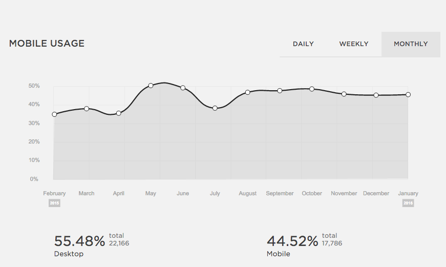
About 50% of web traffic to author sites comes from mobile devices. If your site doesn't play nicely with mobile browsing, your visitors might not make a second visit. Make sure you test your site on a couple different devices to see how it looks. The days of building "a website" are over. Now a web designer builds a thousand possibilities at once, on every page. Also, Google promotes mobile-friendly sites to the top of its search ranks. Make sure your site isn't frustrating 50% of your viewers, just because they showed up on an iPad.

Four: Music and Animations

A sudden soundtrack might be the last thing a visitor needs if she's checking out your site while sitting on a bus or in a library. And gimmicky tracks and unnecessary video slow down web connections, making it tougher for your reader to find the content she wants. 

Five: Intellectual Property That's Not Yours

I know it's fun to use celebrity memes and droolworthy photos, but it's a bad idea. There are legitimate (and illegitimate) cases brought against authors and bloggers all the time for photo copyright infringement. At best it's a headache and at the worst it's an expensive headache. So make sure you use photos you own or which are licensed by the creator for free use. Trouble is no fun!

There are other sins of author websites, but these are at the top of my list. What's at the top of yours?

Noble Advice for that Mobile Device

How are visitors viewing my site, and why should I care?

In ye olden days, say, ten years ago, when we built a website we built a website. 'Tis no longer the case. This is a monthly graph of the percentage of visitors to my romance author site who arrive via a mobile device (tablet or phone.) Nearly half of them are viewing on a mobile device. I'll bet if I wrote YA the number would be even higher. But if I wrote women's fiction it would be somewhat lower.

Screen Shot 2016-01-03 at 7.25.55 AM.png

It's always going to be large, though. That's the world we're living in. You might say--so what? The first thing to know is that Google recently changed the behavior of its search algorithm to heavily favor sites that are mobile friendly. In other words, if your site is not mobile friendly, it won't turn up in search results. Disaster, right?

These days, when a client is sweating over the harmony of new home page content, I sometimes need to remind really her that she's seeing one out of a million different versions of the site. It's going to look completely different on a phone or tablet, and different again when the visitor rotates the screen.

The platform I use to build websites--Squarespace--will only build mobile friendly sites. (They are rated "Awesome" by Google on this front.) Even so, I test every site on a desktop, a laptop, an android tablet and an iPhone 5. The web platform makes different decisions about where to place content for each different screen.

There are trade-offs. I can't always fit everything into the website header that I'd like to put there. Once when we were renovating our tiny New York City kitchen, the contractor shook his head over a design element and said, "everyone is always trying to cram ten pounds of shit in a five pound bag." It wasn't an elegant expression, but I remember it often when I'm designing a website. 

Clean, crisp designs aren't just for hipsters anymore. They work! :)