Things to know before you use Blasty for book piracy takedowns

Update: August 2019

Things seem to have deteriorated at Blasty. See the comments for multiple complaints about potentially fraudulent billing.

A Review of Blasty

This is a tricky one. Blasty is a service I tested for more than a year. At the heart of Blasty is an important service you can't get anywhere else. There are some really great things about it, but I'm too troubled by all its defects to continue using it.

First, you need to understand why Blasty exists. There are many copies of our pirated books on the internet. And the Digital Millennium Copyright Act (DMCA) insists that big search engines and web hosts--like Google, Facebook, Microsoft, etc--have a means of processing cease and desist letters. 

So. Let's say you find an illegal copy of your book on HeyHeresAFreeBook.com. What do you do? There are two possible solutions:

1. Contact HeyHeresAFreeBook.com and get them to take it down.

2. Ask Google to forget the infringing page in its search engine

You should always try #1 first. Some websites will respond to a quick email or a form filled out. But some piracy sites just don't comply. And that's when you can step in and try the second tactic. Google has a long, ugly form for this. But if you fill it out they will "forget" the infringing page in their search results. If you want to do this manually, start here

And now Blasty

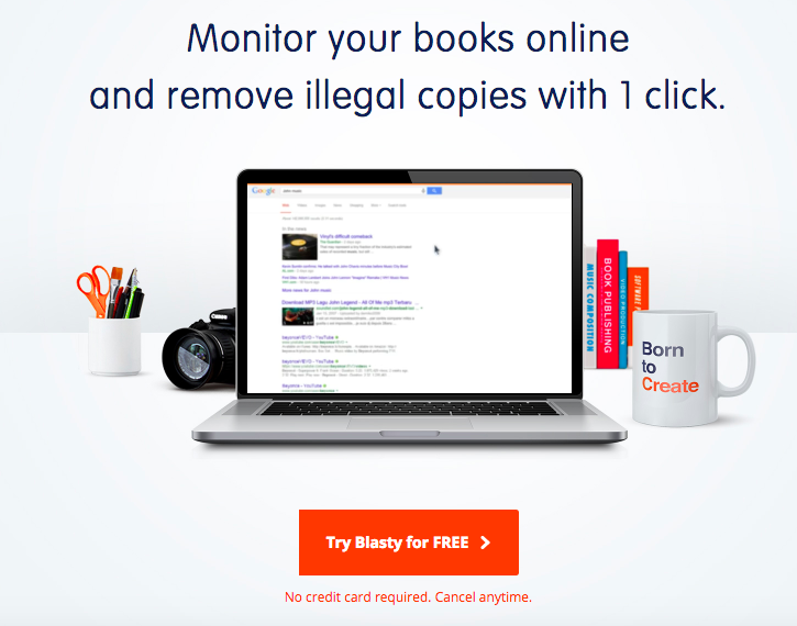
Now, back to Blasty. This is the graphic they have up on their front page at Blasty.co. 

Blasty's front page promise. Is it true? Read this review of Blasty.

Given that appealing promise, which action would you assume that Blasty takes when it helps you find infringing content? "Remove illegal copies with one click." Hmm. That sounds like choice #1, right?

Wrong. In most cases, Blasty's only power is choice #2, asking Google to forget the search link. And, seriously, shame on Blasty for being unclear about this. Authors are smart people with a lot of skills, but we don't always know the difference between a search engine and a web host. I know a lot of people who use Blasty who think that they're zapping files off the web page with one click.

They're not. Not usually.

Here's what Blasty does that is actually very cool: they took Google's hideous and cumbersome takedown form and they automated it. If you're a registered user of Blasty you can one-click the search engine takedown and skip the form.

That is commendable. And that is a good product as long as the people paying for this service actually understand what they're getting!

Google is a big ecosystem, and Google owns Google Drive and Blogger/Blogspot. So in some cases, Blasty may be capable of successfully removing hosted content at Google.

But! More than 90% of the time our infringing content is hosted by somebody other than Google. And there isn't a thing that Blasty does to solve this problem. Hey, that's life, right?

Except the front page of their site leads people to believe that they are removing content from the source. And I think that's ethically wrong, and also bad business.

You might think a Google removal is better than nothing. Sure. But Google only has 60% of the search market at best. And the worst piracy sites often have their own search engines. 

So use Blasty if you wish, as long as you know the extent of its powers.

One More Warning

Blasty also has a paid feature called Auto-Blast, and you should never ever use it. Auto-blast is theoretically a nice idea--Blasty finds infringements of your work and automatically submits takedowns. 

If bots were infallible, that would be a fine plan. 

But bots aren't infallible, and if you use Auto-Blast you run the risk of sending takedown notices to bloggers and reviewers of your book. The bot may call out bloggers during launch week, sending cease-and-desist notices to Google, who will in turn notify the blog.

And then you're the jerk who got a hard-working blogger in hot water with Google just for posting a review! This has happened to at least two authors we know. It's embarrassing and unnecessary. Stay off Auto-Blast and avoid this headache.

How to Set Up Your Author Website so Readers See the Best Stuff First

How to organize your calls to action.

How to organize your calls to action.

“I Want Everything At the Top”

Life is all about choices, and choices are hard. So many authors get stuck on their website designs because they can’t figure out which information is the most important. Or they forget that website visitors aren’t patient people who will read every word and patiently scroll through material to find what they need.

“So What Do I Do?”

Readers don’t just stumble onto your website. They visit for two reasons: 1) they’re responding to an invitation (a link in your newsletter or the back matter of your book) or 2) because they have a question that needs answering. IE “What’s the next book in the series” or “When does the new one come out?”

If you have a tight and sensible navigation, these questions should be answerable within one or two clicks. Easy peasy.

But there’s a difference between satisfying the visitor and getting her to do what we want. What we want, of course, is another sale. Once you realize that we have goals and an agenda, too, it gets easier to figure out how your website should prioritize its content.

The Hierarchy of Author Websites

This is what we want visitors to do, roughly in order:

  1. Click a buy link and purchase (or preorder) the book.

  2. Sign up for our newsletter, thereby granting us more chances in the future of grabbing this reader’s attention.

  3. Read about our backlist books (and then ultimately buy them.)

  4. Enjoy bonus content like blog posts and extras, thereby forming a tighter bond with our author brand. Bonus points for you if there are buy links in all these places, too.

  5. Follow us on social media.

Note the location of that last thing. Authors often ask me to put the social media links higher up on the page. But please remember that real estate on your website is valuable. If those links are front and center, your cover art will sink down the page.

And—really—if someone takes the trouble to visit you on your home turf, do you really want to bounce them to that distraction pit known as Facebook? Social media “follows” aren’t valueless. But I’d argue that they’re a little less valuable each year. So use your visitors’ eyeballs wisely. Keep them on your site or bounce them to a vendor site for their next purchase.

Once you’ve established your website’s goals, it becomes easier to know which content to promote first. Good luck out there!

How to Build an Author Website for Free

This might seem like a strange topic coming from us. After all, we make money when someone pays us to build a website.

But not every author is ready to pay for a site. Maybe your book isn’t out yet, or you simply don’t have the cash to pay for a site. Or maybe your book hasn’t yet found a home with a publisher. If you don’t have a product to sell (and some cover art) then it isn’t the right time to pay for a design.

So what to do? Maybe you did some Googling already about free websites, and you haven’t made up your mind.

Weebly vs. Wix?

Nope. Neither one! Why? The free versions look tacky, and the paid versions aren’t much better. Successful authors seeing good web traffic aren’t using the paid versions of these sites, so that is a big clue right there. So that means the real choice is…

An Authors’ Guild website or Blogger / Blogspot?

In our opinion, the two best options are either Google’s free blogging product or the Authors’ Guild’s free websites. The Guild isn’t entirely free—you have to pay an annual membership fee. But it’s the best deal in town. The AG will review your publishing contracts if you ask them to. They have a message board of sage wisdom, and they advocate for authors everywhere.

Furthermore, you can get an AG website for free once you’re a member. This is, hands down, the easiest way to have a presence on the web.

Google’s Blogger platform is also a perfectly good option. You can make a page that’s static and put that as your home page. So it isn’t really a blog unless you want it to be.

Bottom line: if authorship is your business, you’ll eventually need a professionally designed site. Until that day arrives, free options will suffice.

Don’t forget to use the Eight Things Every Author Website Needs post for reference!

Eight Things Every Author Website Needs

Consider this a cheat sheet for constructing your author website:

One: A Home Page with your latest title on it.

Your cover art should be the first thing a reader sees. You can put other things on the home page, below your main image. But don’t use a sidebar. Those have gone extinct, for a very good reason. There’s no such thing as a sidebar on a mobile phone.

Two: A Contact page

This is probably the most important page on your site, and the one that far too many authors skip. Far too many. If you’re afraid of spam, don’t list your email address. Use a contact form instead. But you must give readers and reviewers a means of contact. And you can’t just send them to your social media accounts. Let those who wish to reach you have a professional way of doing so.

Three: A Bio or “About” Page

Preferably your photo is on this page, to humanize your author presence. Please feel free to keep the bio very short. And leave out this sentence: “I’ve been writing since the third grade when I produced my first book about a lion who ate a dragon.” It’s cute, but it’s done too often.

Four: A page for each book

If you have a 40 title backlist, you can stack these onto series pages instead. Your book pages should link from the main navigation! Don’t make your readers follow you through a rabbit warren to read about your books.

Five: Buy Links to Multiple Vendors

Immediately after your book’s description you should have bright, tidy links to purchase the book at several vendors. You do not want to live in a world with only one bookstore. So take the time to do this right.

Six: A Newsletter sign-up

Your author newsletter is your bread and butter. Yes, your first ten subscribers will all be blood relatives. Starting is hard. But it’s so important to your career

Seven: News/Events/Blog

You don’t have to blog regularly. But you need a spot to post updates. If you don’t like the word “Blog” call it News or Events.

Eight: Privacy Disclosure

This can be linked in the footer, but it should appear somewhere. There are rules about collecting email addresses and using cookies. Your privacy page is where you disclose how you intend to use your newsletter list, and whether or not you have affiliate links on your site.

And…that’s it! Those are the basic ingredients. Go forth and link your books to the world!

Top 5 Biggest Mistakes on Author Websites

Visitors to your author website are precious. Whenever a reader takes time out of her day to seek us out, we want to make sure we're rewarding her with good content and few distractions.

Here is a short list of common sins and how to avoid them.

One: Where is your Contact Information?

When I take the time to make my way to an author's website, half the time it's because I'd like to say something nice. When I can't find any contact information, it makes me feel stabby. And maybe I'm old school, but when I say "contact information" I don't mean your Facebook page. A real email address is pretty important. If you're worried about the address being scraped for spam, you can write it like this: myname (at) gmail.com. 

Yeah, spam is awful. But frustrating your reader is worse! I promise. Make yourself available, so we can say nice things to you.

Two: Where's Your latest Book?

Another top reason I visit your site is to see what's new. And if the new thing isn't immediately visible on your home page, I'm probably going to assume that you don't have anything new! In the immortal words of Paul Simon, I "got a short little span of attention." So don't make me look too hard.

Three: Your Author Website Looks bad on Mobile Devices.

About 50% of web traffic to author sites comes from mobile devices. If your site doesn't play nicely with mobile browsing, your visitors might not make a second visit. Make sure you test your site on a couple different devices to see how it looks. The days of building "a website" are over. Now a web designer builds a thousand possibilities at once, on every page. Also, Google promotes mobile-friendly sites to the top of its search ranks. Make sure your site isn't frustrating 50% of your viewers, just because they showed up on an iPad.

Four: Music and Animations

A sudden soundtrack might be the last thing a visitor needs if she's checking out your site while sitting on a bus or in a library. And gimmicky tracks and unnecessary video slow down web connections, making it tougher for your reader to find the content she wants. 

Five: Intellectual Property That's Not Yours

I know it's fun to use celebrity memes and droolworthy photos, but it's a bad idea. There are legitimate (and illegitimate) cases brought against authors and bloggers all the time for photo copyright infringement. At best it's a headache and at the worst it's an expensive headache. So make sure you use photos you own or which are licensed by the creator for free use. Trouble is no fun!

There are other sins of author websites, but these are at the top of my list. What's at the top of yours?

How to Embed a Preview of Your Book on Your Author Website

This Amazon Widget is a Well-Kept Secret

Wouldn’t it be fun if you could embed a pretty and functional preview of your book on your site? Well you can. And it’s a snap.

So long as you can find it.

Step by Step Instructions

Step 1: navigate to your book’s Amazon page on a laptop or desktop. (The widget disappears on a mobile device. ) Underneath the yellow buy buttons you’ll see a host of options. (Give as a gift! Add to a wishlist!) Then, finally, there are some share buttons and a bashful little option to <embed.>

See that? It’s not well advertised.

Step 2: click on the <embed> link and a dialogue box pops up. Make sure you choose the radio button for “embed on your site.” You can include an affiliate code if you have one.

Step 3: copy the code! It’s that long thing that starts with <iframe and goes on for miles.

Step 4: use a code block on your Squarespace web page, pasting the embed code right in. You should immediately see your book cover and an option to turn pages or buy the book.

Looks great, right? Right.

Nice. But What’s the Downside?

There are a couple of times when you might not want to use these. If you are traditionally published and your publisher spends a lot of resources getting your books into independent bookstores, then you might not want to position Amazon out in front of other retailers. It’s just a thought.

Also, if you use this preview on your book’s web page without using any other images, Squarespace doesn’t have an image associated with the page. This doesn’t matter until you share the page on social media and nothing comes up but text.

Luckily there’s a fix: in the settings menu for your page, you can add your book cover as a thumbnail image for the page. Et voila, pretty previews, too.

savingPNG.PNG

Should I use jpg or png images on my site?

Crisp images without sacrificing loading speed? You're living the dream.

Crisp images without sacrificing loading speed? You're living the dream.

Two of the most common file types for images on websites are .png and .jpg. So which one should you use?

The quick answer is: .jpg, unless you have a website background color that's not white.

Okay, but why?

In general, jpg images have a smaller file size. I just made two 3D book cover images for a client's site. They're identically sized at 841x1190. The jpg is 276k and the png is 904k. In other words, the png is three times larger.

We want your site to load lickety-split. So The smaller file size is crucial.

So, then, why do pngs even exist, you might ask? Two reasons. First, a png can handle a transparent background. If you float a png over a colored background, it will look great. If you want to try to match an irregularly bordered jpg to a website background, it's tricky and it will probably look poor when you're done.

The second reason is clarity. Png is the crisper file type. You know when you're scrolling through Facebook and you see hazy parts of an image? That's poor jpg compression. 

I used to use png files all the time because I was overly worried about that. But if you're exporting jpgs from a good piece of software (like Photoshop or even PicMonkey) you can control the quality of your jpg. The highest quality jpg file will look great and will always be smaller than a png.

You have a need for speed, trust me. There's nothing that looks more amateurish than a website which makes its readers wait. Don't be that author. There is data to show that slow-loading websites have higher bounce rates. We don't want that.

How low can we go?

If you're worried about loading time, you can use a sneaky tool called JPGmini. It's a piece of software that, through voodoo I can't explain to you because I don't know how it works, makes the file size of a high quality jpg even smaller. Give it a try! And keep those loading times fast.

EDIT TO ADD: Now there’s a tool called Squoosh! It also makes photos smaller, and it’s free at the time of this writing. Squoosh offers even more control over quality factors than JPGmini. It’s quite amazing.

Anatomy of a Book Piracy Scam

Sarina Bowen explains one common kind of piracy scam, and why authors can ignore quite a few of their so-called pirated alerts.

This is your friendly reminder that a great number of piracy links aren't really piracy links. Here's a nice example that appeared in my Google alerts today.

The alleged link is to a randomly named site showing all my books.  I do a lot of piracy work, so I already know this site is scammy. This one caught my eye for its boldness--this German book doesn't come out for months, and reviewers don't have copies yet. The probability of this book appearing on a real piracy site is super low.

Screen Shot 2018-08-11 at 9.34.06 AM.png

So why does it show up here? Let's see what happens when we try to get to the file.

When I click on the download now link, I'm delivered to the front door of a site called Talkietimes. It looks a lot like the front door of Playster used to look. (Playster is a legitimate subscription service.) When I enter my email and a password to sign up for free, I'm taken to this screen:

"We don't want to charge your credit card! We just want the number anyway." Uh huh.

"We don't want to charge your credit card! We just want the number anyway." Uh huh.

They ask for a credit card number just to validate your country location. Yeah, right. This is probably a phishing scam site. 

The other possibility is that it's an affiliate scam. It's possible that those who enter their credit card numbers are actually signing up for a membership at a subscription service without their knowledge. The fraudsters here would get an affiliate commission from that legitimate site, and the reader who thought she'd entered her credit card number just for verification would find that after a free trial period, she was charged. 

And my books? They're just bait. Those covers and titles just tease the potential reader into walking down the scammer's path. If this is a phishing scam, the trickster doesn't need any actual files to reel in his victims. If it's an affiliate scam, the trickster doesn't bother checking to see which titles the legitimate service actually has.

What did we just learn?

Here's the takeaway: it's really easy for a programmer to use the Amazon API to pull in the covers and descriptions of your books, and to make it appear that your books are on a nefarious site. You can ignore these sites. In fact, their existence might actually help you! The harder it is for a thieving reader to find actual pirated copies of your work, the less fun book piracy becomes.

But how do I know what's what? you might wail. Some piracy should not be ignored. (IE audio on youtube. And that obnoxious Canadian site where you can perform instant takedowns on screen.) The smart author knows which sites to police, especially around publication day.

It comes down to this: are you able to easily download your file off the piracy site? Or can you read your entire book online on the site? If the answer to either of those questions is yes, that site is worth fighting. Fire up your cease and desist letter and get rid of 'em. 

But, alternatively, does the site try to get a credit card number? That's a nope. Walk away. Or does the site want to send you to another site to get the book? Why would a real file sharing site do that? It wouldn't! Any site that's trying a little too hard to get your attention or to visit another site is just a scammer with his own agenda. Ignore him.

It's like parenting. Pick your battles. Life is easier that way.

Sarina Bowen

7 Things Facebook Advertising Courses Won't Tell You

IMG_1388.PNG

These days there are a lot of expensive Facebook advertising classes. Please know that I don't mean to imply they're a scam. The people who teach those classes know a lot about how Facebook advertising works. And it's complicated, so they have plenty of great material to teach.

However.

It's their job to impart that information (and cash your check) without judging whether or not Facebook advertising will change your life. It might. But it might not. And since we're not charging you for Facebook ads, we are quite happy to point out all the pessimistic details. So if you decide to take the plunge, you'll be fully informed.

1. Facebook ads cost between 100% and 500% more than they did a few years ago.

In other words, everything you can learn about Facebook ads works less well than it used to. When I ran my first Facebook ads I was getting .01 clicks in the US. But that was more than ten years ago. Even as recently as 2015 it was possible to get .05 clicks over a long period of time. These days you can still hit that price sometimes, but it's far more common to pay .10 to .25. 

This data from adespresso cuffed the average CPC (cost per click) in 2017 at $1.10 in the US. That price would be a nonstarter for most authors I know. Why? Read on...

2. The Facebook advertising machine is not optimized for selling $4.99 ebooks.

Inconvenient truth: Most of the things that people are hawking on Facebook cost more than an ebook. The good news is that people are more likely to click on something that's cheap. That helps keep your CPC lower than average. 

But the seller of an adorable $25 T-shirt has a higher tolerance for her click cost than you do. At similar conversion rates, she can afford to pay $1.10 because her profit is higher than yours. And guess what? You're competing for clicks with people who are selling T-shirts and luxury cosmetics and Facebook advertising courses for $700. Also Teslas. 

Important note: If you're pitching, say, book 1 in a six book series, you are selling something that costs more than $4.99. You're selling an onramp to more revenue. That means Facebook ads will always work better for authors with a deep backlist and more product to sell. If you're a newbie, think that through before you invest.

And if you have a deep backlist, you still need to make great ads and target them carefully. Although...

3. Running Facebook ads isn't just an extra marketing arrow in your quiver, it's a part time job.

This may be the single biggest misunderstood thing about using Facebook ads as an author strategy. It's work. Even after you know what you're doing.

If you embrace Facebook advertising as a business strategy, know that you will be constantly making ads, testing ads, tweaking ads and redesigning ads. Unless you are clairvoyant (and then I want to hire you to run my Facebook ads) you will not know ahead of time which cute bit of ad copy will perform. Or which photo of an attractive man. 

Ads get stale. And carefully targeted audiences get stale, too. So even if you are an ad-writing ninja, you will still need to stay on top of it. Especially because...

4. Facebook changes their interface as often as we change our socks.

They are raking in the billions, and that requires constant tweaking, too! So be prepared to learn new names for every component when they change them, and to reinterpret new reporting. And to test new options. Also...

5. Facebook can cut you off at any time. They won't tell you why, and you can't ask a human.

This is a truly terrifying thing, and it happened to me. One day last fall I suddenly got an email notifying me that due to advertising practices which violated Facebooks TOS, my account was closed. Since I had a new release coming the following week, I panicked, as one does. There was a link to appeal, which I clicked. I wrote something like, "Dear Facebook. I really don't think my ads for this book violate anything. Could you please help me understand what's going on?"

It was a stressful 24 hours but eventually I got another notice that more or less said, Oops, everything is fine. Carry on. My account was restored. But for some people the appeal fails. And since I no longer have a Facebook ads rep (I did, but then he disappeared!) there was literally nobody I could ask.

6. Success begets success. But you knew that already.

Facebook ad gurus can teach you exactly how to calculate the ROI (return on investment) of your Facebook ads. We can calculate down to the penny how many cents per click you can pay for an ad on a $3.99 book with a 5% conversion rate.

We can, but it would still be wrong! Because each purchase you make on Amazon or iBooks boosts your rank there. And only the books with a good rank receive any visibility on either platform. So. If you advertise a book that has a terrific rank already, each marginal sale will pinball you a little higher on the charts, increasing your organic visibility at the 'Zon. 

Conversely, if you're advertising a book with a rank in the millions, a marginal sale will bring you up into the 900,000s, right? It sounds like a big move, but Amazon won't show you any extra love if the book only sells a copy or two each day. 

Result: ROI matters more on books with a terrible rank than for books with a great rank. If you're already selling hundreds of copies a day, you can actually run Facebook ads at a loss and still profit by elevating your rank and remaining visible.

Yes, that's complicated. And discouraging. But our algorithmic overlords run the world, and they rule with iron fists and sharp little teeth.

7. Sometimes it's the book and its packaging.

Nobody ever wants to hear this. But even if you make a brilliant, clickable ad, if your book's vendor page doesn't seem appealing, you won't convert. Once you convince that Facebook troller to click, she still won't fork over her money if she feels let down by the product itself. Is your flap copy enticing? Does your cover art sing? Do you have a lot of good reviews to help push that buyer over the hump? Ask yourselves these important questions before you spend your money on ads.

In Conclusion

This all might read as if we don't like Facebook ads. We do! We use them all the time. But we do so with eyes wide open. It's a really hard job, and there are days when we spend way too much time on it. And we live in constant fear of having invested ourselves in this manner when we should have been writing more books instead.

We don't have all the answers, but we love debate on this subject! How have ads been working for you?

Mailchimp vs. Mailerlite

UPDATED: July 2018

Mailchimp and Mailerlite are both good Email Service Providers (ESPs.) Mailchimp is certainly dominant in the business. Their generous free plan--up to 2000 subscribers--hooks many who are then too lazy to switch later on.

Mailchimp also has the most integrations, meaning that if you're using other software and services, you can often make those services "talk" to one another easily. 

But Mailerlite is catching up. Fast. In fact, last week they announced an integration with Instafreebie. 

I switched from Mailchimp to Mailerlite when my monthly bill hit $150. In fact, my bill very quickly went from $75 to $150, and my whining could be heard for miles. 

The price difference is fairly extreme. With 15,000 subscribers, Mailchimp is $150 while Mailerlite is $65.

Still, I was reluctant. Mailchimp is powerful, and I was comfortable with its nomenclature and functions. Mailchimp can do some things that Mailerlite can't do, particularly with regard to creating geographic segments from your lists. 

Regarding geography, the GDPR legislation in Europe forced Mailerlite to add "location" as a segmenting tag. But it still isn't as granular as Mailchimp's geographic information. For example, at Mailchimp I could send an email to all my subscribers who live in Michigan. At Mailerlite, I can only determine which ones live in the U.S.

Now that I've been a customer for eighteen months, I'm pleased to say that I actually like Mailerlite better. I find their webforms easier to use and more attractive. Mailerlite will let you make an infinite number of landing pages, which I am now using for all sorts of purposes. Here's one I made in about five minutes to host a contest. And here's one that I use to give away a free book for newsletter signup. (Update: Mailchimp finally rolled out landing pages, too.)

And I like the things that Mailerlite is still working on--their segmentation is already more powerful than when I switched. They recently unrolled a powerful new automations (autoresponder) interface. And now they're working on "tagging" which will basically make their segmentation tools better.

Meanwhile, over at Mailchimp, they are working on Facebook advertising. And I am baffled. Why would I need to run Facebook ads out of my Mailchimp account when I can just run them right at Facebook? They must get a nice cut of the advertising revenue. Greedy much, Mailchimp? Their other point of development seems to be abandoned shopping cart recovery, which authors who drive traffic to vendors like Amazon can't use at all. 

Not everything is perfect at Mailerlite. They produce some baffling so-called stats. There's an option to receive a daily email message to tally new subscribers and lost subscribers. But the numbers are useless, since if you simply move someone from Group A to Group B, they count the gain in Group B as a new client. So unless you have your automations and group activities memorized, the daily email is potentially useless.

Also, when you're moving subscribers around from group to group, the site won't index quickly. The group totals won't update for hours, so after subscribers are reorganized, you have to walk away and check your work hours later.

And yet I carry on! For authors with lists greater than 2000 members, it's hard to argue for Mailchimp in this marketplace. Mailerlite wins the day.

How to Give Away a File in Exchange for an Email Signup

IMG_2232.PNG

Hi friends! It's fairly standard practice these days to reward readers who sign up for our newsletters with bonus content. This post will cover a couple of technical details on how to do that.

Note: this tutorial assumes that you already have a signup form which begins the process of sending the reader's name to your Email Service Provider (like Mailchimp.)

Know Your Audience, Choose Your Format

If you're giving away a full length book to an audience that's technologically savvy (like, say, romance readers) you might wish to give out an epub or mobi (Kindle) file. So your first step would be to prepare those files.

If you're giving away a shorter document, a pdf should work just fine. Format your document in preparation for sharing it.

Host the File

Whether you wish to make that file available on your Squarespace website or via your email service provider (like Mailchimp or Mailerlite) you will need to host it somewhere. Why? Because email service providers (ESPs) do not like attachments

Since all ESPs are a little different, I'll show you how to host the file on your own site. Go to a private page that you manage and add a link to the text somewhere. Instead of pasting in an external link, choose the "files" option instead. You will be offered the chance to upload your file. 

Save your changes to the edited page.

NOTE: Here is the Squarespace Tutorial for Uploading and Managing Files.

Grab Your Link

Now you're ready to link to your hosted file. Hover over the link you made and right click to copy that link. If you should paste this copied link into a browser window, you will immediately be offered your own file as a download. See how that works? The link will be a squarespace link, and it will be long and ugly. But we don't care! That's our file's new home address.

Here's my example! I just created this link and uploaded a photograph to it.

The link is ugly when I right-click-save-link it. It looks like this: https://authorclicks.squarespace.com/s/1LineWedsquare.jpg

There's an even uglier version if I paste it into a browser window. Then it's: https://static1.squarespace.com/static/5656311ee4b04cd6ce7debd8/t/59136f50ebbd1af9b15c7590/1494445908639/1LineWedsquare.jpg. So try to grab the first version with a right click!

Add the Link to Your ESP (Mailchimp Example)

Since all ESPs are a little different, you will have to decide where the file link goes. In Mailchimp there are two good spots, and using both of them is a viable option. You probably want to hand over your bonus content after the reader clicks to confirm their subscription, right? Therefore: 

1. Go to Lists > (your list) > Signup Forms > General Forms and choose Confirmation Thank You Page from the dropdown menu. You will see the thank you page, and you can add your link in the body of text you find there. (Click here to download my story, etc!)

2. Go to Lists > (your list) > Signup Forms > General Forms and choose Final Welcome Email from the dropdown menu. Add a sentence about your freebie and the link here as well.

Note: Mailchimp will actually host your file for you if you wish. When you're editing the content, add a link. When you're editing your form/confirmation email, highlight some text. Choose the link icon from the style editor and when the link-adding popup appears, change the dropdown menu from "web address" to file and upload right there. 

Other ESPs

I'm using Mailerlite these days, and it allows me to shut off the double opt-in. So my bonus content goes into an automation that begins immediately upon signup. 

If you get a lot of newsletter signups and readers are having trouble opening your files on their own devices, you can use a service like Instafreebie or Book Funnel to handle the delivery. Both are pay services.  

When is the right time to build your author website?

Here at Authorclicks, we turn down design jobs with some frequency. Sometimes we're just too busy to meet a new client's deadline. But we will also turn down a job if the author just isn't ready.

Today we heard from an unpublished author who was querying agents with her first manuscript. "I've been told I need a simple website," she said. 

At the risk of showing our age, we've had a hand in the publishing biz for a long time. And even though it's always scary to be a newbie, we can assure you that no agent has ever said, "I would have offered to represent this author if only she had an expensive new website." 

Agents and publishers know that everyone starts somewhere. And here at Authorclicks we really don't want to waste your money. So let's prioritize.

The Right Moment

The best moment to debut your professionally designed author website is the moment you receive your first book's cover art. Why? Two reasons.

1. The point of an author's website is to sell books. And until you have cover art, you don't have a product. We know people like to use phrases like "building buzz" and "getting my name out there." But you are not the product. To misquote Shakespeare, the book is the thing.

2. Your book's cover art shalt not clash with thy website design. We at Authorclicks never marry web designs too closely with cover art. But since the cover and the site must live in harmony, designing one without the other is a bad idea. 

Do you really want to redesign your website when the cover art shows up? We didn't think so.

If you feel naked without a corner of the web to call your own, head over to Google's Blogger platform and make yourself an introductory page. And then buy a domain somewhere like GoDaddy and point it at your website. Boom. Problem solved.

Publishing is a slow-moving industry. There's a lot of waiting. I understand why authors are impatient to make progress. But spend your pennies wisely, and only when it's time.

Where eBook Sales Happen

doreaders.jpg

You know how much I love data! I'm constantly trying to understand the mechanisms by which my books reach the hands of buyers.

Today I was peering at my January affiliate earnings when I noticed something useful. There were just shy of 2000 transactions on my US Amazon.com affiliate account this month. If you have an affiliate account, you know that you get paid not just for ebook sales but for other things that people buy within a 24 hour period. So I have sales for my books, other people's books, and crystal champagne glasses, software and the dust filter for someone's vacuum cleaner.

One of the data items provided in my report is the "Device Type" where the purchase was made: Mobile or Desktop.

Data alert! I've already written about how often my website is visited by mobile users. But I didn't know if mobile buying was catching on, too. Browsing and buying are quite different activities. (If they weren't, we'd all be rich, since data suggests that the conversion rate of an online shopper is something like 4%.)

Well. I broke my purchasers' data into ebooks and other. And the results were pretty interesting! 68% of ebook sales made on my affiliate account were done on a mobile device, vs. 32% desktop. However. All the other stuff people bought (vitamins, movie rentals, audiobooks, song downloads, software, toys. Everything!) looked differently. Those percentages were flipped: 64% desktop and 36% mobile. 

The data on ebooks is the most convincing, of course, since that's what my buyers clicked in the first place. But if we wanted to know: are ebooks usually purchased on mobile devices? The answer is HECK YEAH! 

What to do with that information? Make sure you have links to the rest of your catalog in the backs of your books, for starters. Hopefully that tablet or phone reader will click through to your next book and keep on reading. 

And when you're contemplating website changes, never stop thinking mobile. Mobile mobile mobile. It's what's for dinner. And breakfast. And lunch.

Don't Make this Rookie Mistake on your Author Website

This cat is happy because his photo was obtained legally on a stock photo site.

This cat is happy because his photo was obtained legally on a stock photo site.

Can we talk about imagery? Websites need lots of it. A blog post looks naked without a photo, right? Without the dancing cat, this post is just a wall of text.

But there's one kind of image that's always the wrong choice--the one you don't own.

I know it's all kinds of fun to use a Ryan Gosling meme on your site. But it's a bad idea, even if you've seen others do it. You could easily get tripped up by either a legitimate copyright claim, or a scammer trying to scare you into paying a legal fee to make him go away.

If you think it couldn't happen to you, read this woman's experience.

Using only images to which you have rights is also just the right thing to do! Authors who would be dismayed to find their own ebooks pirated on a sketchy website should respect the work of photographers, too.

So where can you get cheap and free photos to use?

Deposit Photos has thousands of pictures, and some of the least expensive prices of any of the stock photo sites.

Wikimedia Commons collects photos for common use.

You can also use the advanced filter of Google Image Search to find photos which are "free to use, share or modify, even commercially." Look under usage rights to find this setting!

And be safe out there!

Noble Advice for that Mobile Device

How are visitors viewing my site, and why should I care?

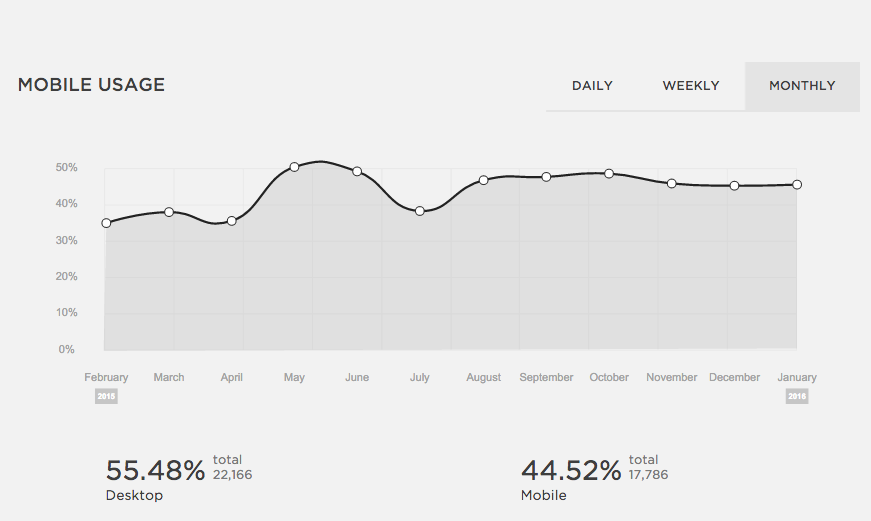
In ye olden days, say, ten years ago, when we built a website we built a website. 'Tis no longer the case. This is a monthly graph of the percentage of visitors to my romance author site who arrive via a mobile device (tablet or phone.) Nearly half of them are viewing on a mobile device. I'll bet if I wrote YA the number would be even higher. But if I wrote women's fiction it would be somewhat lower.

Screen Shot 2016-01-03 at 7.25.55 AM.png

It's always going to be large, though. That's the world we're living in. You might say--so what? The first thing to know is that Google recently changed the behavior of its search algorithm to heavily favor sites that are mobile friendly. In other words, if your site is not mobile friendly, it won't turn up in search results. Disaster, right?

These days, when a client is sweating over the harmony of new home page content, I sometimes need to remind really her that she's seeing one out of a million different versions of the site. It's going to look completely different on a phone or tablet, and different again when the visitor rotates the screen.

The platform I use to build websites--Squarespace--will only build mobile friendly sites. (They are rated "Awesome" by Google on this front.) Even so, I test every site on a desktop, a laptop, an android tablet and an iPhone 5. The web platform makes different decisions about where to place content for each different screen.

There are trade-offs. I can't always fit everything into the website header that I'd like to put there. Once when we were renovating our tiny New York City kitchen, the contractor shook his head over a design element and said, "everyone is always trying to cram ten pounds of shit in a five pound bag." It wasn't an elegant expression, but I remember it often when I'm designing a website. 

Clean, crisp designs aren't just for hipsters anymore. They work! :)

The Three Biggest Trends in Author Websites

Like hem lengths and pop music, web design is trendy. And here's what we're seeing lately!

1. Landing pages

Everybody's talking about Landing Pages (aka Squeeze Pages) but not everyone agrees what they're for. Broadly speaking, a landing/squeeze page has only one action available on it. So the visitor who arrives there (usually by following a link) can either DO THE THING (sign up for a list or push a button) or leave.

If that sounds pushy, it is! The landing page cures visitor ADD. If your visitor doesn't have access to your main navigation, she can't suddenly say, "Ooh! a sparkly thing!" and dart away before you collect her email address. So a landing page is potentially useful. But I think it's bad manners to allow your main URL / domain to point to a landing page. It's like inviting a friend over for tea and then demanding they buy Girl Scout cookies before they step over the threshold. Besides--if you play your cards right, you might sell those Thin Mints, anyway.

2. Vertical, baby

It used to be that every site you visited had a navigation bar across the top, with predictable labels: About, Home, Contact.

Not anymore! The new trend is to require website visitors to scroll downward in a straight path through all your content. Like the landing page, it prevents user ADD by drawing your visitor down a long hallway by the hand.

I liken this trend to the way that wall cabinets fell out of favor in kitchen design. Trendy kitchens now look really sleek with all that tile showing on the walls. But suddenly there's nowhere to keep the coffee cups. And vertical websites look sort of corporate to me. It's a little chilly.

So when we design a site we try to have it both ways. It's nice to offer more content to the visitor who is willing to keep scrolling. However. I always put a handy main nav on every site I design. Because sometimes our readers arrive looking for something specific! And I don't want to frustrate my visitor. I'd rather she's able to find what she's looking for, and quickly.

3. The Pop Up. It's Back

It's deja vu all over again. The pop up is back. But the 2016 version of the pop up is sleeker and softer than the old kind. And it's (usually) not ads that spring up before our eyes like snowdrops in March. It's a newsletter sign-up.

Now, pop-ups are a little annoying. Or they can be if done poorly. But they're still something I'm willing to use. Why? They work. Studies have shown that conversion of visitors to newsletter subscribers is higher with a pop-up than without.

And you can program a pop-up to happen only as frequently as you set it. Instead of it appearing on every page, you can make it disappear forever once it's dismissed the first time.

Those are my three biggest trends. Do you notice others?

One Romance Author's Web Stats: Do You Know Who Your Visitors Are?

I got a marketing email from an app builder that I've worked with today, and the title was Do You Know Where Your Social Traffic Comes From?

To that question I can say, why yes I do! Squarespace has fabulous analytics. And while a girl can get a little too hung up on her web stats, I do like to think about how I'm spending my precious time. So let's take a peek.

Now, this is a slow week. I didn't publish anything, announce anything, post any teaser excerpts or reveal a cover. I sent out a newsletter, though. The lack of activity means the data is even more robust, because the people who are finding my website this week have sought me out or opened my newsletter.

"Direct" is the source for over 60% of my visits. Those visitors came to the site via clicking a link or typing the URL into their browser. Those links are found in the back of my books and in newsletter emails. There's not a lot to be learned there. And 17% came from Googling.

It's further down that I start to really learn something. Facebook is 12% and Twitter is 2%. (Note: I'm not running any FB ads or boosting any posts at the moment, either.) Lately I'd already been feeling that Facebook brought me much more meaningful interaction with readers than Twitter ever will. But it wasn't easy to quantify until I looked at these numbers. How much better is my time spent on FB than twitter? Six times more, apparently.

And Goodreads? Yeah. Not so much. Less than 1% of website visitors found me via Goodreads. And my set-up at Goodreads is fairly robust--with lots of links in my bio, and a blog that populates on my author page and into the news feeds of my friends.

So, while Facebook continues to frustrate us with its new algorithmic stiff-arm, it's still the best social media outlet for reaching readers. This month, anyway! 

And since Squarespace puts these trusty web stats at my fingertips, I'll be able to spot the trends.

Sarina